Sending off the year 2015, we present to our readers the mapmakers who contributed their work to the 2015 GeoHipster calendar.
***
Ralph Straumann
Q: Tell us about yourself.
A: I’m a senior information management consultant with Ernst Basler + Partner in Switzerland as well as a Visiting Researcher at the Oxford Internet Institute (OII) of the University of Oxford in the UK. In my day job I consult clients regarding effective and efficient data infrastructures, data processing, and information-centric workflows. With the OII, I do research on Information Geographies. Besides these topics, I have a strong interest in information visualisation, cartography, politics, journalism and blogging.
Q: Tell us the story behind your map (what inspired you to make it, what did you learn while making it, or any other aspects of the map or its creation you would like people to know).
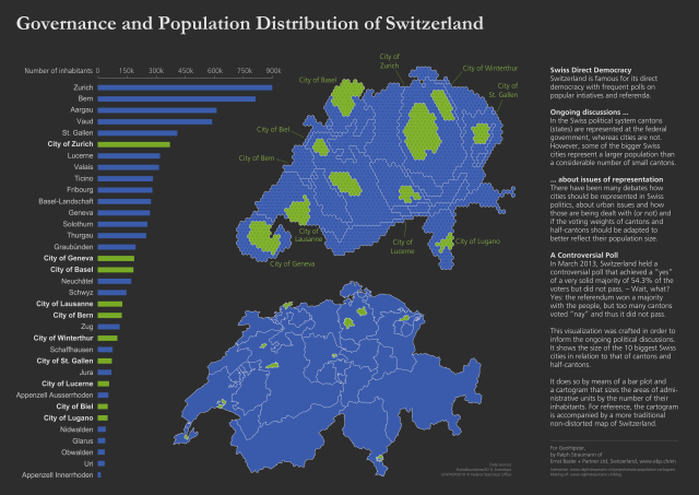
A: My map in the 2015 GeoHipster calendar was inspired by my interest in politics and the MAUP (modifiable areal unit problem). Switzerland (where I live), through its approach of direct democracy, has frequent votes on popular initiatives and referenda. For illustration: since 2000, 225 votes have been held at the federal level alone! (There are also votes on cantonal (state) and municipal levels)
In Switzerland, political division often shows itself not so much between language regions (anymore) but between urban and rural parts of the country. At the federal level, metropolitan areas don’t have direct representation, but cantons do (and of course citizens through political factions). However, some of the bigger Swiss cities represent a clearly larger population than a considerable number of small cantons or half-cantons. Thus, there are ongoing debates about the political representation of cities’ particular challenges and policy interests at the federal level.
Additionally, in many situations, for a vote to pass it doesn’t only require the majority of voters agreeing but also the majority of the cantons and half-cantons. Here, small cantons and half-cantons (that are found mainly in rural parts of the country) can have what some people perceive as unfair political weight – especially compared to their political counterparts, the metropolitan areas. So we have discussions if the voting weights of cantons and half-cantons should be adapted to also reflect their population size in some way.
Within this setting, I wanted to come up with an innovative display of the actual weight of cities as compared to cantons. I opted for combined and linked cartogram, map and bar diagram. In March 2013 and while I was still working on the visualization, Switzerland held a controversial vote that met the agreement of 54.3% of the population but did not pass, because it didn’t get the required majority of cantons. This result was quite particular because of the rather solid majority of the people in this case.
On the way back from a trip to the mountains I got news of the forecasts of this vote and I decided on the spot that I had to finish the (interactive) visualization on this day and put it online. I managed to do just that and the results did indeed draw much attention: the map has been broadcast on Swiss national TV as well as re-published in various media and reports. So I gladly think it helped foster discussion.
Q: Tell us about the tools, data, etc., you used to make the map.
A: Let me take a step back and talk about the contiguous, hexagon-based cartogram I made and acknowledge its source: This is an idea I got from Leicestershire (UK) when I was researching cartograms. The UK has the concept of Lower Super Output Areas (LSOAs). These conveniently contain roughly 1,500 residents each. So Leicestershire Statistics and Research Online could use them as base-units for their hexagonal cartograms; which in turn served as my inspiration. I talked to a Leicestershire representative and he kindly told me that their cartogram design workflow included the use of a lot of post-its. This was clearly not a viable approach for me 😉
Instead, I used a combination of ArcGIS, a custom tool from Jenness for hex grids and Scapetoad to design my hexagonal cartogram. The process is not too complicated but [for] quite some thinking and also (in my opinion: indispensable) manual work went into it. I explain all the various aspects, data sources and tools in two blog posts. For the interactive version of the visualization I used Mike Bostock’s D3.js. The version in the GeoHipster calendar was made using Crowbar (to extract the SVG shapes) and in Inkscape.
Given the production history of this visualization in which I got input from various people (from Leicestershire, but also e.g. Danny Dorling and Adi Herzog), I felt a duty to document my approach and methodological considerations in order to help others in the community to build on my work. I was very pleased to see Mike Bostock, Stefano de Sabbata, Xaquín Gonzalez and Andy Tow picking it up. And I re-used and refined the approach for work with the OII on Wikipedia and internet access as well as for the Guardian’s coverage of the Generel Election. They often get a bad rap, but I think there is a niche where cartograms are valuable.
Comments
2 responses to “13 maps in 13 days: Ralph Straumann”
[…] you know that our very own Ralph Straumann is on the advisory board of the international GIS community website ‚GeoHipster‘? And if you also want to become an advisor to an international community, you have may to start […]
[…] http://www.geohipster.com/2015/12/21/13-maps-in-13-days-ralph-straumann/ […]