In our series “Maps and mappers of the 2016 calendar” we will present throughout 2016 the mapmakers who submitted their creations for inclusion in the 2016 GeoHipster calendar.
A Cornell graduate in the natural resources field, Peterson can still be found spending part of the workweek absorbed in data analysis and mapping for the greater environmental good while reserving the rest of the workweek for broader mapping endeavors, which includes keeping up on the multitude of innovative map styles coming from all corners of the profession.
Peterson speaks frequently on the topic of modern cartographic design, and it was in one of these talks that the Ye Olde Pubs of London’s Square Mile map was not only shown off but also created on-the-spot as a live demo of the cartographic capabilities of the QGIS software. The FOSS4GNA 2015 conference talk went through the process of loading and styling data and then creating a print composer map layout.
Some highlights of the demo included the custom pub data repository created just for this map, the demonstration of the relatively new shapeburst capabilities of QGIS, and the technique for modifying image file (SVG) code in order to allow icon colors to be changed within the QGIS interface.
The map was also the focus of a QGIS cartography workshop held in Boulder, Colorado. The students at that workshop followed the instructions posted on github to create the map. It’s a great two-hour project for introducing the software and a few of the principles of cartographic design, and readers are encouraged to give it a try and supply any feedback you may have.
I am a Cornell graduate in the natural resources field, and can still be found spending part of the work week absorbed in data analysis and mapping for the greater environmental good while reserving the rest of the work week for broader mapping endeavors, which includes keeping up on the multitude of innovative map styles coming from all corners of the profession.
Q: Tell us the story behind your map (what inspired you to make it, what did you learn while making it, or any other aspects of the map or its creation you would like people to know).
A: This map is just a snippet of a world-wide basemap created specifically to be placed underneath users’ data layers to provide geographic context. To that end, the color palette is muted and, though the product for which it was originally created was discontinued, it still works nicely as a stand-alone map.
My team created it using OpenStreetMap data pulled down with imposm3 via a custom mapping JSON file to pull down the specific bits of OSM that we wanted. Osmosis was then used for processing, and at one point we even had a good working changeset procedure to keep the map continuously updated.
The styling went through several iterations to arrive at this look and feel, and was then continuously tweaked as the project evolved. This is pretty typical when designing a webmap that has to be incorporated into a website’s overall aesthetic, which itself evolves through time. The surrounding site and the webmap must have a design alliance achieved through continuous dialog.
Q: Tell us about the tools, data, etc., you used to make the map.
A: The map was tiled with GeoServer and the styles were written out in SLD. When I began the project I wasn’t familiar with SLD, so I used the GeoCatBridge product to get some good initial SLDs created with the kinds of filters that I needed, and then proceeded to develop them as straight-up SLD from there. Getting proper RegEx statements going is always a challenge, but we also got that going in the end to get the right features and labels to show.
As far as labeling goes, a font was used that had enough character sets to style all the languages we wanted to support world-wide so that labels wouldn’t show up as empty glyphs.
From beginning to end I’d say the project took about 3 months. There’s definitely some robust infrastructure that’s needed for these huge OSM world-wide pulls, especially if you want to set up a dev environment to try out new styles with — as we did — while still running the full map in production for existing users.
Last month GeoHipster put out a call for maps for the 2016 GeoHipster calendar. The response was overwhelming, with nearly two dozen maps being submitted. The submissions represented a cross-section of the cartographic talent and imagination of the geospatial industry. The GeoHipster advisory board certainly had its work cut out for it.
We would have loved to have simply used all of the maps we received, but Pope Gregory XIII gave us a calendar that only had room for twelve. So we are happy to announce the authors whose work you will be seeing throughout 2016 (in no particular order): Meg Miller, Asger Petersen, Jacqueline Kovarik, Terence Stigers, Katie Kowalsky, Rosemary Wardley, Ralph Straumann, Gretchen Peterson, Jonah Adkins, Stephen Smith, Mario Nowak, and Andrew Zolnai. Congratulations to each of you, and thank you for your support of GeoHipster and your dedication to the craft of mapmaking.
GeoHipster has adopted a mission of exploring the state of the geospatial industry from the eyes of those working in it, and the response from the community has been humbling. Part of that mission is celebrating the great work and creativity resident in the community. As part of that celebration, GeoHipster will be publishing a feature on each map throughout 2016 so our readers can learn a bit more about how and why each map was created. We will be doing this not only for the 12 maps selected for the calendar, but for all of the maps submitted this year, in recognition of the support and creativity shown by all who participated. We are excited to expand GeoHipster to include the art of our community.
Finally, we’d like to give a shout out to Mapbox for their continued support of GeoHipster’s independent content, this time by sponsoring the 2016 calendar. Their support will help expand the types of content we offer next year, including reprising the “young professionals” showcase of up-and-coming talent that was debuted this month.
The calendar is currently being designed, and will be ready to order by the US Thanksgiving holiday. It makes a great gift, and is a super way to answer the inevitable question we all field from our family during the holidays: “So what is it that you do?”
Gretchen Peterson is a cartography explorer who is constantly on the lookout for new techniques, tricks, and solutions that collectively elevate the status of maps. Peterson shares these adventures in her cartography books, blog, and twitter stream, and also, sometimes, cracks extremely funny nerd jokes. As a Data Scientist at Boundless, Peterson designs basemaps with open source technology, and recently wrote a blog series on QGIS.
Q: You’re pretty much renowned the world over for your cartography publications (Cartographer’s Toolkit, GIS Cartography: A Guide to Effective Map Design First Edition and Second Edition). Tell us a little bit about your background and how you came to be an author.
A: Thanks Jonah, but I’m definitely not renowned the world over. In fact, before I took a position at Boundless last year, one of my siblings was counting unemployed people in our family and included me in the tally. It was obvious that not even my own siblings knew what I was doing all day, even though at that time I was running a successful geo consultancy. That said, I do occasionally run into people who know me, which is a pretty neat thing, although it can be embarrassing when you’re recognized taking a selfie with your own book at the Esri User Conference bookstore.
My background is in natural resources. I’ve been a life-long advocate for environmental stewardship, and GIS, as a means of cataloging, understanding, and anticipating Earth’s processes, was a subject that a professor urged me to study and was the subject of my second most important internship. (The first was censusing common terns, which involved less time on a computer and more time getting pooped on.)
My first non-internship job was at a technology firm in which I was asked to not only do GIS but to also make maps of the results. This is that moment when you realize how important proper results visualization is for your own career’s sake as well as for the success of the projects that you’re working on. If an analysis points out where the county should purchase land to protect an important species, you’d better be able to map it adequately.
There was a significant dearth of practical cartography books at that time: the early 2000s. With some training in design — I was a landscape architecture major in college my first year — I decided that if no adequate books on the subject materialized in the coming decade, I’d figure out good map design principles myself and then write about it for others. And that’s exactly what happened. The first book I wrote is more of a comprehensive textbook on cartography while the second is full of practical tools like color palettes and typefaces. It turns out that both books have been embraced by college professors and career professionals alike.
Q: You recently made the jump from being a private consultant to working for Boundless as a Data Scientist. Has that been an easy transition?
A: Working at Boundless has been just as exciting as I had hoped it would be. Some of the brightest geo minds work there, and they have a sense of pride in helping do good things for the geo community. I think that in most professional positions one ultimately is happiest when making important contributions, whatever they may be, and I have plenty of opportunities for that in this position.
Q: You give regular cartography tips on your blog. If you could give only one piece of advice to someone what would that be?
A: This is not a fair question! I’ve been giving advice on my blog for close to 5 years, and there’s still so much I haven’t covered! But seriously, if I had to say only one thing it’d be to study existing maps, both old and new, and begin to compile a list of map patterns that can come in handy for future mapping projects. The patterns part of map patterns is a term I’ve borrowed from software engineering where it’s been shown to be a good idea to thoroughly understand how problems are commonly and most efficiently solved. They say that all innovation is derivative, and that extends to cartography as well.
Q: I think we got started in GIS around the same time (late nineties) — we’ve seen a lot. What do you think is the greatest accomplishment in cartography in the last 5 years?
A: The greatest change has been the movement from cartography as a medium that only specialists could use to cartography as a medium that everyone can use. This new ease-of-use has resulted in an influx of design-oriented, rather than science-oriented mappers to join the field. As a results, the aesthetic level of all maps has increased dramatically and thereby engaged the public to such an extent that they’ve become demanding users of maps rather than blasé bystanders by virtue of the maps’ enhanced readability, interactivity, and beauty. This is all good.
Q: We had a conversation once about emotional cartography/ers and the need for affirmation (#mapaffirm). Are you an emotional cartographer, and why is affirmation in design work important?
A: Ah yes, this is an important subject, especially for those new to the profession. It’s a “haters gonna hate” kind of situation with the map critics out there. And some mappers get down about how their maps are received.
I’m not an emotional cartographer, but that doesn’t mean I shouldn’t be sympathetic to those who are. Gordon MacKenzie, who wrote Orbiting the Giant Hairball, talks about his position at Hallmark as one of shoring up employees’ egos. If a designer came to him with an idea, he invariably responded that it was a good idea, whether or not it truly was. His reasoning was that if it wasn’t a good idea, the designer would eventually realize that and halt production. Perhaps along the way the designer, with the confidence of being backed by a design director like MacKenzie, would come up with a superior product idea.
We also have to remember that rarely does anyone appreciate creative endeavours, especially those that push boundaries, as much as they should when the object is first released. Only time can prove the utility and lastingness of a great map. Just as Mark Twain had to stand up for himself after an editor tried to suggest changes to one of Twain’s introductions, so we can too, for the maps we make today, whether or not they win awards this year or meet with critical favor at the time they are first released. (It did not end well for the editor. Twain not only refused to edit the piece, but also rescinded the piece altogether.)
So, even if you feel like you need to attend a meeting of Emotional Cartographer’s Anonymous, you must have a certain courage when it comes to publishing maps. And if a map that you made was indeed a terribly misinformed piece of drivel, then just remember what @mysadcat said, in its infinite wisdom: https://twitter.com/MYSADCAT/status/468835053863452674/photo/1.
Q: What are your desert-island, all-time-top-5-favorite maps?
A: First and foremost would be Google Maps. It’s likely the most extensively and most frequently used map, with the most factual coverage, and with the biggest team behind it, that the world has ever seen. By a long shot. It’s Lewis Carroll’s life-sized scale map concept at heart, in that it contains so much spatial information at such large scales that it comes close to being intellectually life-sized but has none of the cumbersome problems that Carroll’s 1:1 scale map would have.
“It has never been spread out, yet,” said Mein Herr: “the farmers objected: they said it would cover the whole country, and shut out the sunlight! So we now use the country itself, as its own map, and I assure you it does nearly as well.” –Lewis Carroll, The Complete Illustrated Works, Sylvie and Bruno Concluded
The second choice would be any thematic map that illustrates the power of zoom-level mapping, where one can discern patterns at many scales, and thus draw from it a multitude of important conclusions. Dot maps are particularly well suited for this, such as the Ethnical Dot Map by the University of Virginia Demographics Research Group.
My third choice would be the Dymaxion map of world wood-density, which is made of wood and foldable. It has all my favorite components: a cool projection, a very meta media vs. content message, and it’s tactilly interactive! The creativity that went into this is inspiring.
My fourth choice would be the North American Bird Flight Range Shifts series for the intuitive animations of ranges over time, the small-multiples aspect, and the underlying mission to better understand our natural resources through superb visualizations. Plus, the Stamen Design blog post on the subject includes a gif of an owl being bopped on the head by a much smaller bird.
And lastly, I would bring along a kusudama made from the pages of an old map book. This work of art was created especially for me by a good friend. Personal maps should always be kept close to the heart.
Kusudama made from the pages of an old map book
Q: The standard #GeoHipster interview question: What does the phrase mean to you and are you a #geohipster?
A: My guess is that a geohipster would be a person who is receptive to new techniques and new technologies inasmuch as they make a better world through geo. A geohipster would also be a person who is able to reach into the past for anything that can be adapted and put to good use in the present.
In this sense of the term geohipster I would hope that I could be included. I don’t fear new technology but I also don’t want to dwell on it to the exclusion of other ideas that could be useful, since cartography is fundamentally about where things are, not about the technology that displays them. Just as we don’t need parchment anymore for maps, so too we may not need computers in the future. As long as I’m massaging spatial information into wisdom or into tools that make wise decisions possible, I’m happy.
I do have to confess to never having GPSd my biking trips. If that’s one of the criteria, then I’m not a geohipster.
Q: What’s next for you? Any new books planned?
A: No new books are in the works at this time, but I’m looking forward to discussing cartography and QGIS at the upcoming Denver Geospatial Amateurs gathering and FOSS4GNA.
We are excited to announce that the first-ever GeoHipster wall calendar is ready for production. We thank all who submitted maps for the calendar, Christina Boggs and Carol Kraemer for co-originating the calendar idea, and Christina again for her ongoing assistance with logistics and curation.
The 2015 GeoHipster Wall Calendar makes a great holiday gift for the geogeek on your list, so pick up a few. The proceeds from the calendar sales will help GeoHipster offset our operational costs, stay ad-free, and maintain independence.
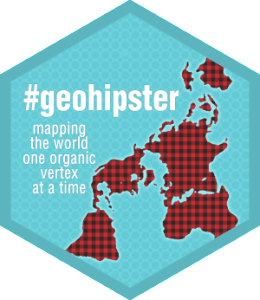
The 2015 GeoHipster Calendar is available for purchase from CafePress. All calendars are made to order (you need to specify January 2015 as Starting Month (as opposed to the default setting — the current month)).
The calendar features maps from the following map artists (screenshots below):
Gretchen Peterson
Jonah Adkins
Ralph Straumann
Markus Mayr
Bill Morris
Andrew Zolnai
Stephen Smith
Damian Spangrud
Farheen Khanum
Christina Boggs
John Van Hoesen
Steven Romalewski
Joachim Ungar
GeoHipster 2015 Calendar cover layout
IMPORTANT! The screenshot below is intended ONLY to give an overview of the overall layout — which map goes on which page, etc. When you order the 2015 calendar, you will get the 2015 calendar. You can verify this by reviewing each individual page online before you order.
Q: You became an Esri employee when GeoIQ became part of Esri. Tell us about your mission at Esri.
A: Esri has had a long and storied mission to transform the world through geography. This philosophy was directly in line with our vision at GeoIQ. The difference is that I now have the support of a global community of users across government, business and organizations that are already using our tools and platform to manage their data, ask questions through spatial analysis, and ideally share this with the public.
My mission at Esri is to connect this community into the web where it has the immediate potential to connect with billions of people and give them direct access to their government, scientists, and local community organizers.
More specifically we are currently developing capabilities of the platform that leverage the best of both worlds — GIS and the Web. This includes adapting to community-adopted data standards for discovery and interoperability; interactive visualizations that realize the potential of hypermedia interfaces; and easy to use developer tools for anyone to experiment and share their own ideas.
Q: The GeoIQ acquisition signalled Esri’s commitment to open source. But can a software company with “closed source” embedded in its DNA reinvent itself? Is your role there to catalyze a metamorphosis?
A: If you want to talk about DNA, Esri has actually deeper roots in open-source. Anecdotally I’ve met colleagues at Esri that were hired by submitting patch requests to software when we used to ship the source code in printed binders.
The obvious benefit of building in open access through a system is that developers can better learn the capabilities and are given the freedom to experiment and develop custom solutions that fit their particular goals. Esri works across nearly all levels of government, business, and domains of science and engineering. This open access is imperative for each industry to best serve its own needs.
The concepts of open access have evolved over the past decades. Previously it meant libraries, SDKs, and APIs. Increasingly, and fortunately, modern declarative programming languages combined with the web have given us the ability to quickly share code and also to make it easily understandable and reusable. Imagine trying to comprehend someone’s Fortran77 code or COBOL — no wonder Esri used to hire anyone with the diligence to decipher the machine code!
Regardless, Esri has not had the awareness and perception of being an open company. So my role is multi-purpose. To clearly demonstrate where we are and have been effectively making our platform, standards, and code open and available. And secondly to work within our teams to improve where it is lacking and has a real benefit to the community to improve access.
Q: How much of today’s (geo)technology choices are driven by fashion? How much are driven by ideology? Open source development and adoption, in particular: Is it driven by fashion, ideology, or pragmatism?
A: This is a long discussion by itself. Generally I think people are both pragmatic in using the tools they have available, but aspirational in what they want to become. So anyone choosing technology is going to look at their mentors and determine the best path from where they are to how they get to be like that person — for whatever value reason that may be. Open source in particular espouses so many different meanings to different people it would be nearly impossible to understand the difference between fashion, ideology and pragmatism. Fortunately we all have the freedom to vote with our time — and can choose the tools that we like using and hopefully also get the job done.
Q: You manage to command respect even in the most anti-Esri corners of the Twitterverse. How do you explain that?
A: Maximal SPM (Slides Per Minute).
Thank you for saying so. I am dedicated to share what I’ve learned and listening to others’ ideas. I keep an open mind and always ask for honest feedback — as I would rather know what can be better than accepting things just because.
Q: We haven’t heard much about GeoCommons lately. What is going on with that?
A: Look at our recent Open Data initiative, let your eyes unfocus like an autostereogram (magic eye) and you will begin to see the new shape emerging. We are committed to continuing and growing the GeoCommons community and vision — and you’ll hear more on that soon.
Q: In recent months we have seen the rapid growth of MapBox and Boundless — both serious Esri competitors. Just today (Monday, March 3, 2014) Gretchen Peterson — a top geospatial influencer — announced joining Boundless. Is this a trend? What do you make of it?
A: Foremost that there is a positive growth in the availability and utilization of location data. That alone is something to celebrate as it’s been talked about for decades and is finally part of the vernacular.
Second it indicates a positive trend in the desire for technology that improves geospatial data management, analysis, and visualization. It demonstrates that despite the common moniker “spatial isn’t special” that in fact it still requires some “very special spatial people” to solve the unique (and interesting) problems. ‘A rising tide floats all boats’
Q: The Esri International Developer Summit is coming up. Any exciting announcements we should look forward to?
A: Chris Wanstrath, CEO and Co-Founder of GitHub is our keynote speaker. That alone should signal our commitment, and validation, to open-source initiatives. Besides that — you’ll have to wait and see 🙂
Q: Thank you for taking the time to do this interview. Is there anything else you want to share with the Geohipster readers?
A: Make your own path. Technology today lets you conceive an idea and deliver it to millions of people in a matter of minutes. Share, experiment, fail, try again, share — ride that geofixie like a boss.