In our series “Maps and mappers of the 2016 calendar” we will present throughout 2016 the mapmakers who submitted their creations for inclusion in the 2016 GeoHipster calendar.
***
Ralph Straumann
Q: Tell us about yourself.
A: I’m a senior information management consultant with Ernst Basler + Partner in Switzerland as well as a Visiting Researcher at the Oxford Internet Institute (OII) of the University of Oxford in the UK. In my day job I consult clients regarding effective and efficient data infrastructures, data processing, and information-centric workflows. With the OII, I work on various topics in the field of Information Geographies, e.g. who and where produces, disseminates, accesses, and reproduces information on the internet. Besides these topics, I have a strong interest in information visualisation, and cartography, obviously.
Q: Tell us the story behind your map (what inspired you to make it, what did you learn while making it, or any other aspects of the map or its creation you would like people to know).
A: My map in the 2016 GeoHipster calendar is part of a small series of maps and visualisations in the Geonet project of the OII. My collaborator, Mark Graham (Senior Research Fellow at the institute), and I started the series with an updated version of the OII internet population map, or rather: cartogram. This was followed by an analysis of how internet access has evolved over time, both from a global and explicitly spatial, and a more regional perspective.
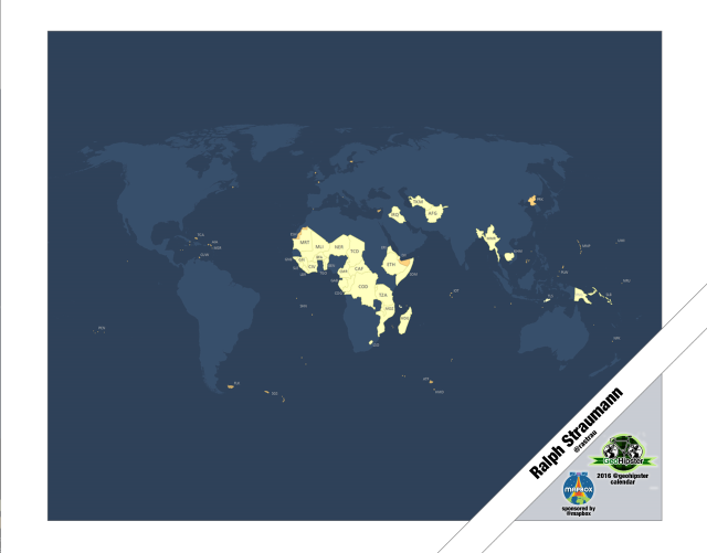
Further, we wanted to look specifically into those countries and territories that tend drop out of internet population maps because of their very low internet penetration rates. Thus, we mapped the places where internet penetration is below 10% (i.e. only 10% of the population have accessed the internet at least once over the last year) or for which the World Bank offers no data or estimates. Seeing the shape of it, we called this region the Archipelago of Disconnection.
To highlight this region and the implications to a wider audience, Mark and I came up with this very simple map design and a very subtle colour scheme. Because the message of the map itself seemed so powerful to us, it didn’t need much embellishment or emphasis. The Archipelago of Disconnection is geographically centred on Sub-Saharan Africa where 28 countries have internet penetration rates lower than 10%. To think that in these places very few people have access to all the vast online resources that much of the rest of humanity is so accustomed to! Effectively, these countries and their residents are largely barred from participating in the cultural, educational, political, and economic activities that the modern internet affords. This is what Mark and I wanted to draw attention to.
Q: Tell us about the tools, data, etc., you used to make the map.
A: Quite simply, the data we used encompassed the World Bank’s Worldwide Development Indicators dataset and spatial data from Natural Earth (a fantastic resource!). The input data needed some work in order to make the identifiers of territories truly congruent (not all of them are well-defined and globally agreed upon).
Then we used ArcGIS 10.3 to design the map; the overall production involved clearly much less work than the aforementioned cartograms. I somewhat atypically opted for manual labelling as I found tweaking labelling placement rules did not give satisfying results with a sensible time investment.
All in all, the map which can be seen in full detail here (with accompanying text and the annotations the calendar team opted to remove) is a pure ‘GIS map’.
Comments
One response to “Maps and mappers of the 2016 calendar: Ralph Straumann”
[…] http://www.geohipster.com/2016/01/04/maps-and-mappers-of-the-2016-calendar-ralph-straumann/ […]